
Spotify (SPOT) – “Spot” a Pattern?


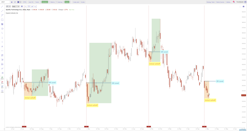
1. The chart below goes over an interesting pattern that has happened over the last 3 earnings releases and is happening once again after the most recent earnings release.
2. This is a daily chart of Spotify since July of 2020. The vertical dashed lines show anytime there has been an earnings release over the last 10 months. Notice that there has been an initial selloff after every earnings shown by the orange highlighted box and text shown as “initial selloff”. This selloff generally occurs for about 1-2 weeks and then reverses hard to the upside.
3. One thing to note by the green boxes showing the move up after the initial selloff is that the price always moves up past the initial earnings price. This most recent earnings move down has a “gap” in price which would be the initial target above around $290 if this reverses to the upside.
Jake WujastykTrendSpider, Founding Member, Chief Market Analyst & Evangelist